Contents
Find The Most Common Mistake on Create Fashion Banner
Nowadays, people are moving into social media for any activity. They will be open social media more than three times in one day. Because of that, the marketers around the world take advantage of that opportunity. They let people exposed by advertisements such as a banner.
The banner is an inexpensive and effective way. You can set the segment, target them, then make your position. What you have to do is just make sure the ads are representative to deliver the information.
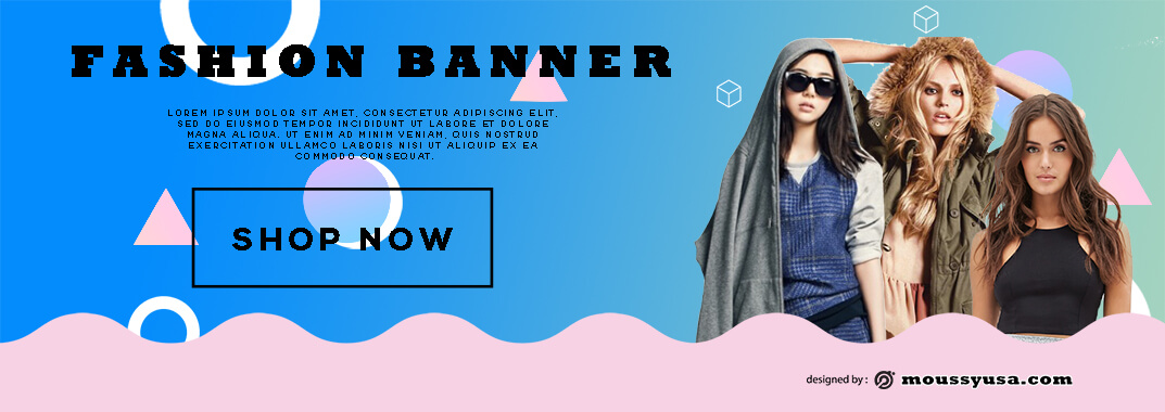
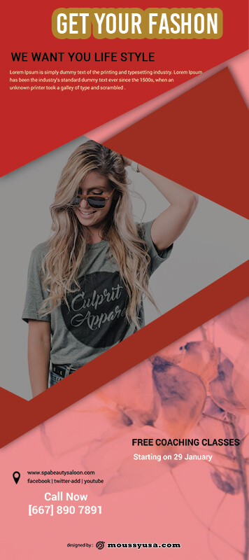
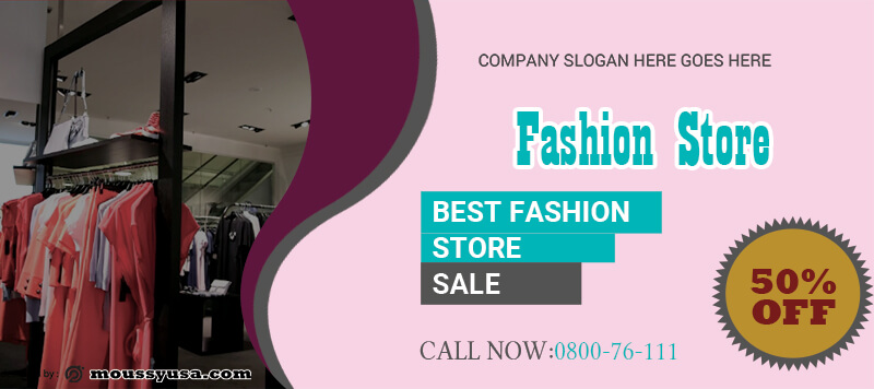
In the fashion banner, you can find the sample of the product is the main focus of the banner. The sample will enhance your brand image, so that make sure the banner is impressive, not an embarrassing one.
- 3+ Coffee Shop Rack Card psd template free
- 3+ School Banner template free psd
- 3+ Travel Agency Banner psd template free
- 3+ Lifestyle Banner free psd template
- 3+ Birthday Photo Book Cover psd template free

The Common Mistake Fashion Banner
To check another thing you have to remind, please read this post carefully before releasing your fashion banner images to the world.
-
The spelling and grammar rule
I know both of these are the tricky point. There are a lot of hidden rules that you don’t know. Just take your time, use a software check, and discuss it with the expert are the answer.
People will see spelling and grammar mistakes are a fool and an unprofessional act. Of course, that will impact your online shop. They may think fashion is lack of quality too.
-
Inappropriate images
The image should correlate with the banner and message. Because this is a fashion banners, so use your fashion picture. Often, the online shop uses the picture from an image. It decreases the honest of your product if in fact it totally differs.
-
Missed the contact info
Ideally, your fashion banner images feature the platform to buy the product, address of offline shop if you have, phone number of customer service, and website or link to social media profile. It depends on who your audience target.
These mistakes sometimes are acceptable, but if you do very often is unforgivable. Damn it!
-
A lot of crowd and mess
Make the information about the product is clean and clear. So use these guideline patterns: the audience, the goals, benefit features, the strategy, and profile.
Meanwhile, you can use testimonials from the customer, not at all, but the positive one is enough.
Too much text and information on the banner will confuse and bore the audience. Test the banner to your friend or others and revise if it will need it.
-
Keep it aesthetic
Clashing colors and too many effects have hurt an eye. Colour is a powerful tool to communicate the message from your fashion banners. I suggest using color theory. For example, orange is a stimulating appetite, and red is bold or brave. This theory spread not only meaningful but aesthetic if you combine the palette carefully.
While the effect such as word art should be simple. Sometimes, less really is more.
Set out to learn all the mistakes so you can nail the fashion banner in the right way. Good luck, fellas!
Sample Fashion Banner Template

